
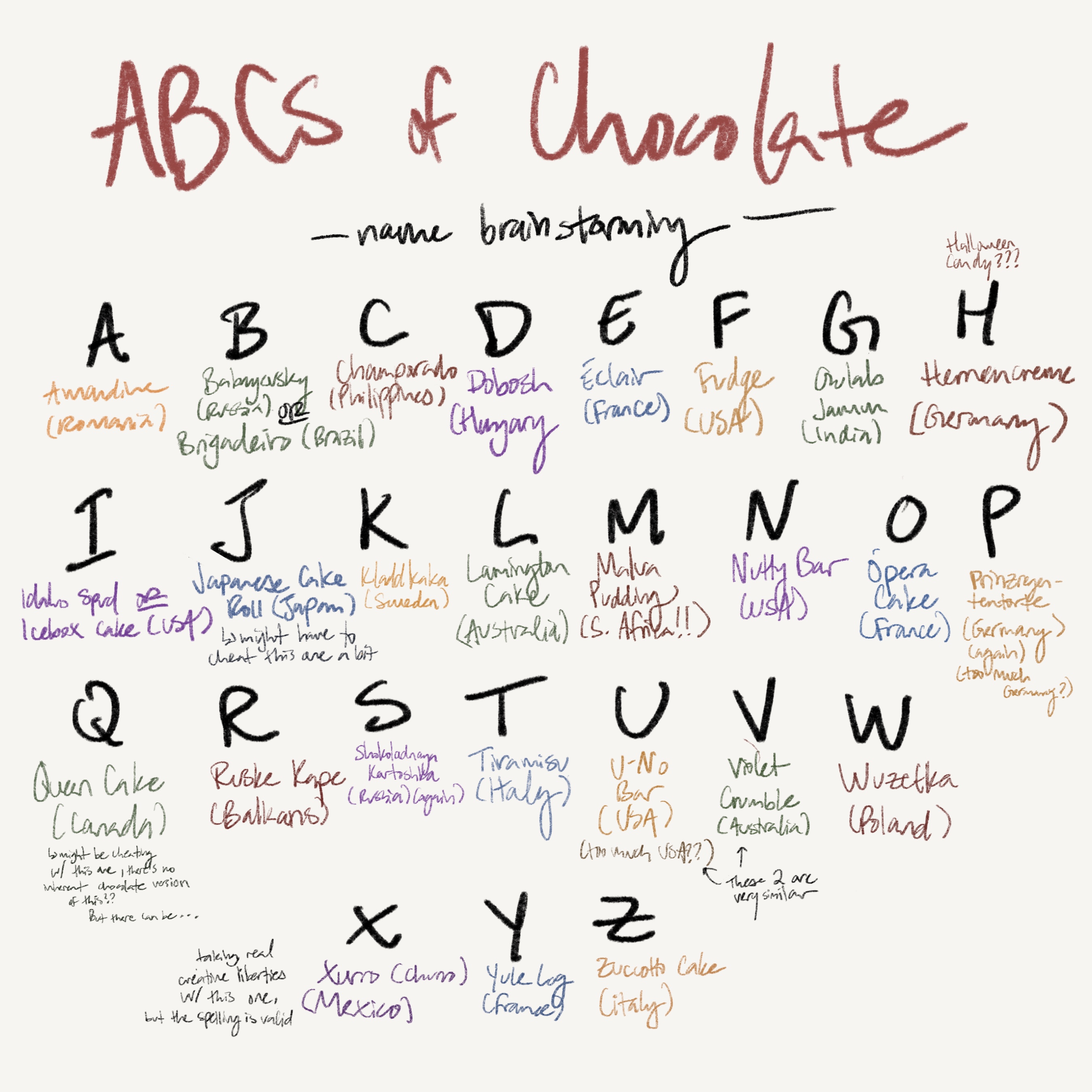
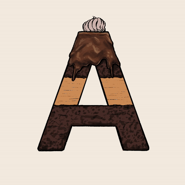
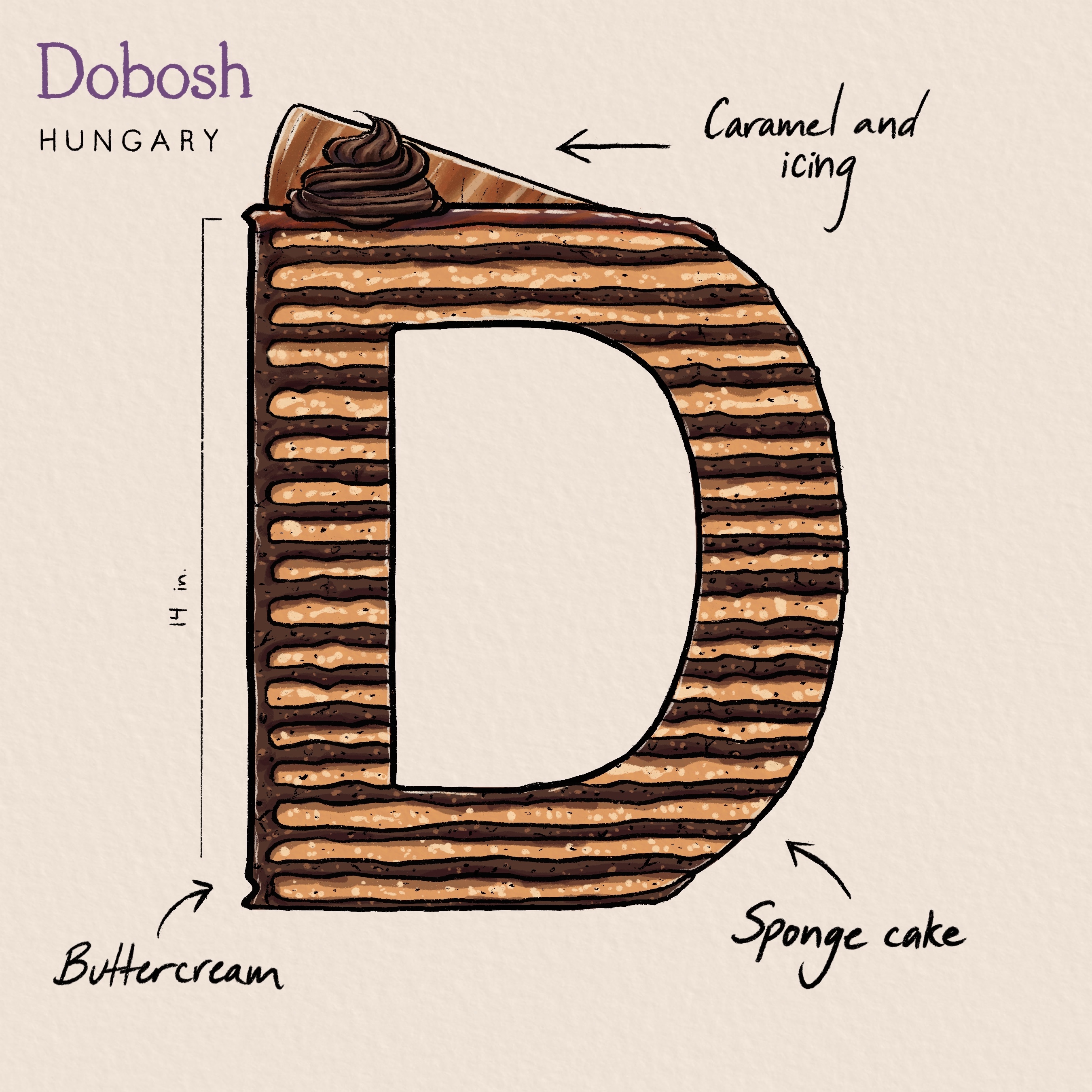
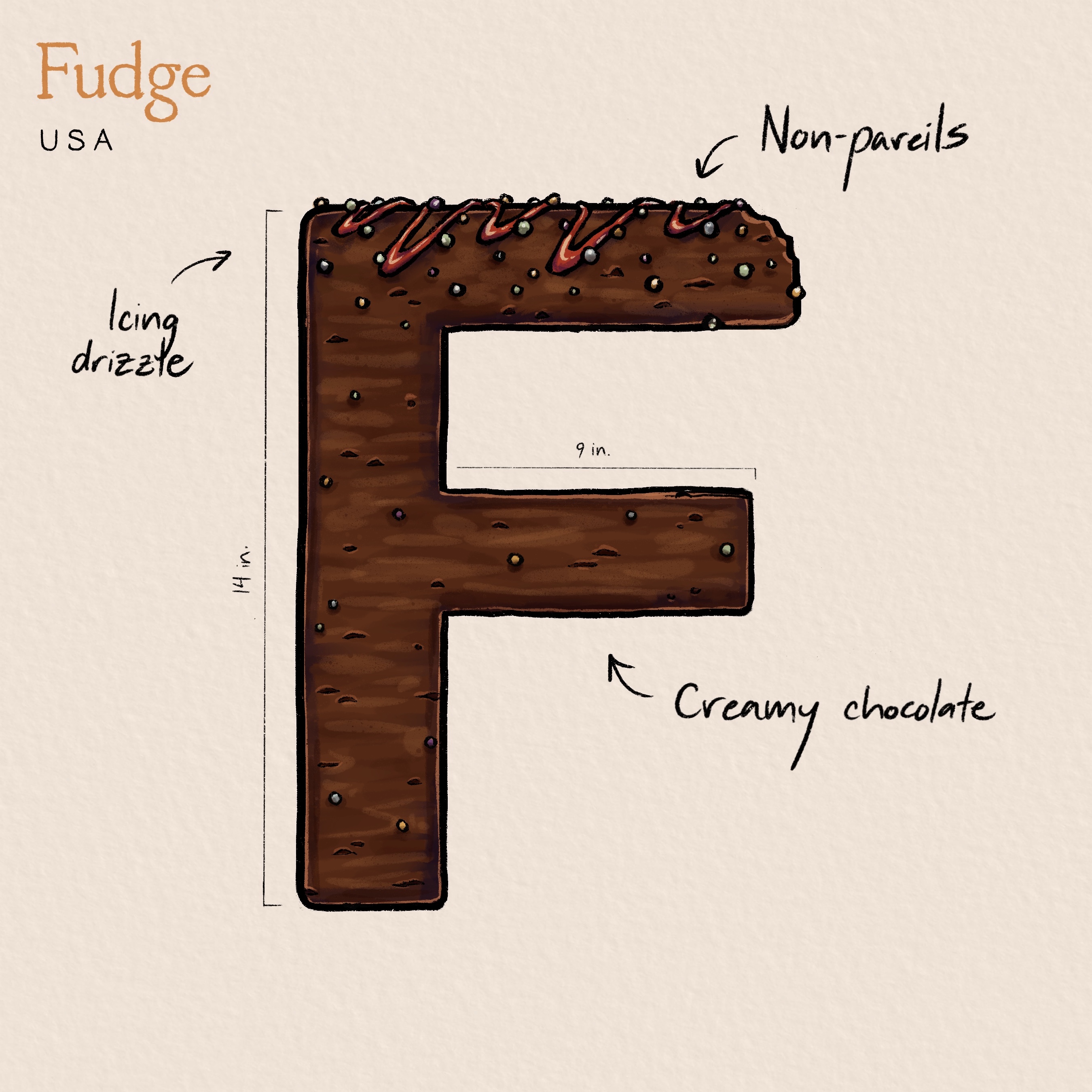
ABCs of Chocolate Campaign
Do you ever find yourself craving chocolate but don’t know where to begin? Well, I do! That’s why I decided to create the “ABCs of Chocolate Campaign” - an English alphabet system based on a national holiday - to celebrate World Chocolate Day and raise awareness for an abundance of different desserts around the world. As an artist, I wanted to push myself to the limit by experimenting with a new style and showcasing my love for illustration. This case study will take you through my design process and reveal the final results of this sweet, delicious project.
DELIVERABLES:
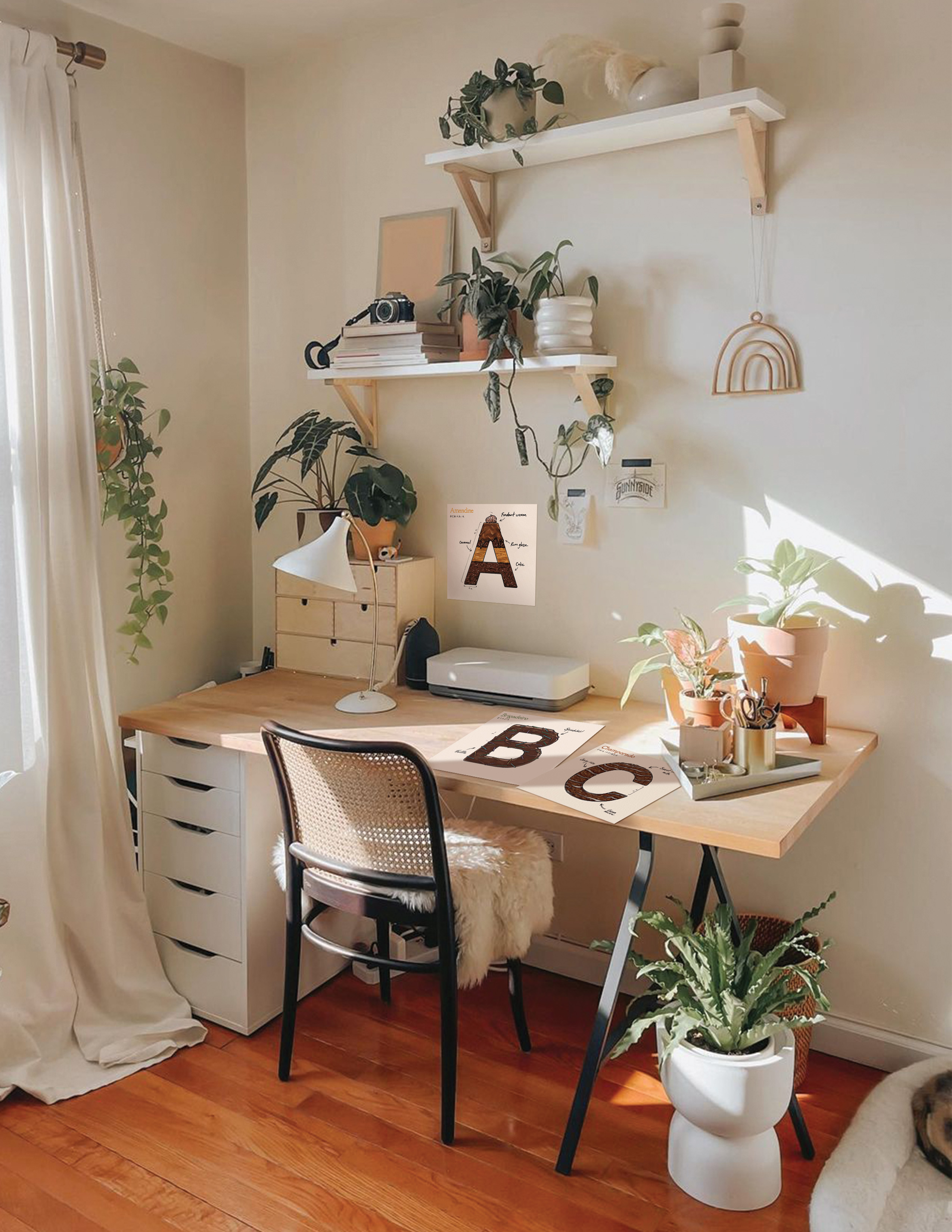
- 26 separate illustrations, one for each letter of the English alphabet
- A poster containing every letter combined
Art Direction: Monica Brodovsky
Medium: Procreate, Adobe InDesign
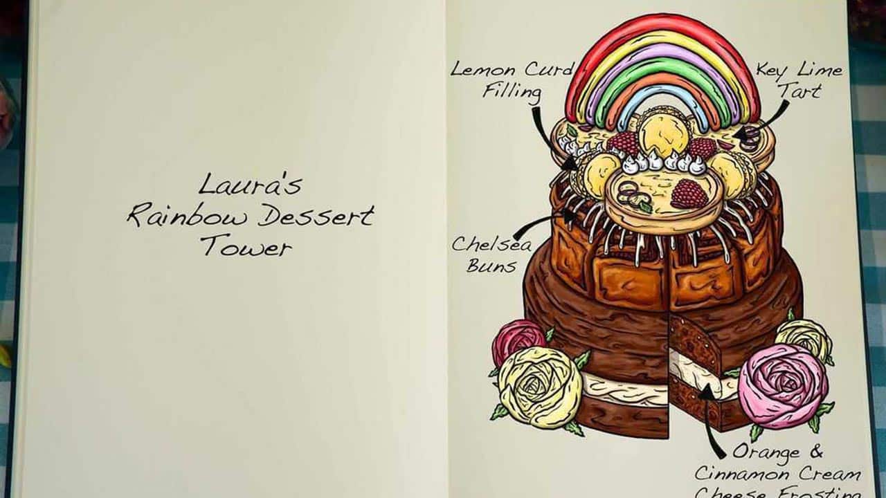
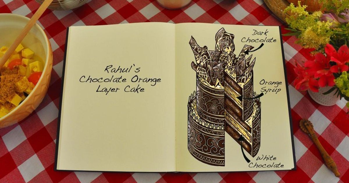
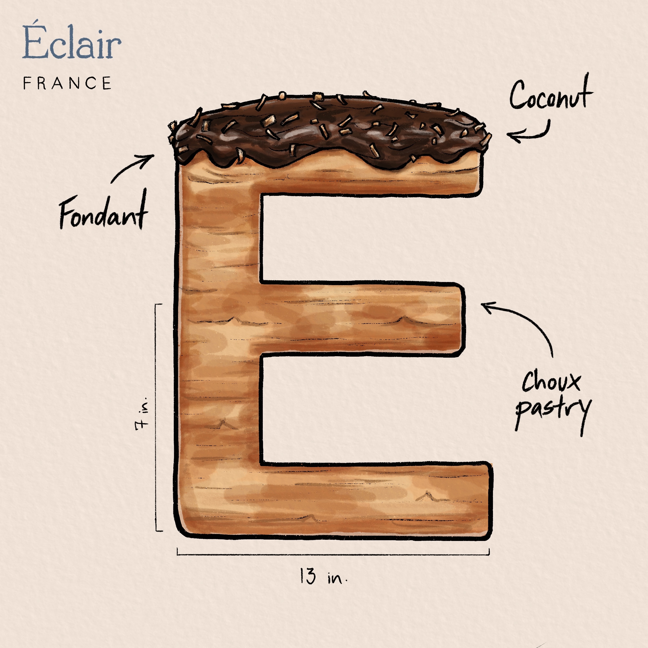
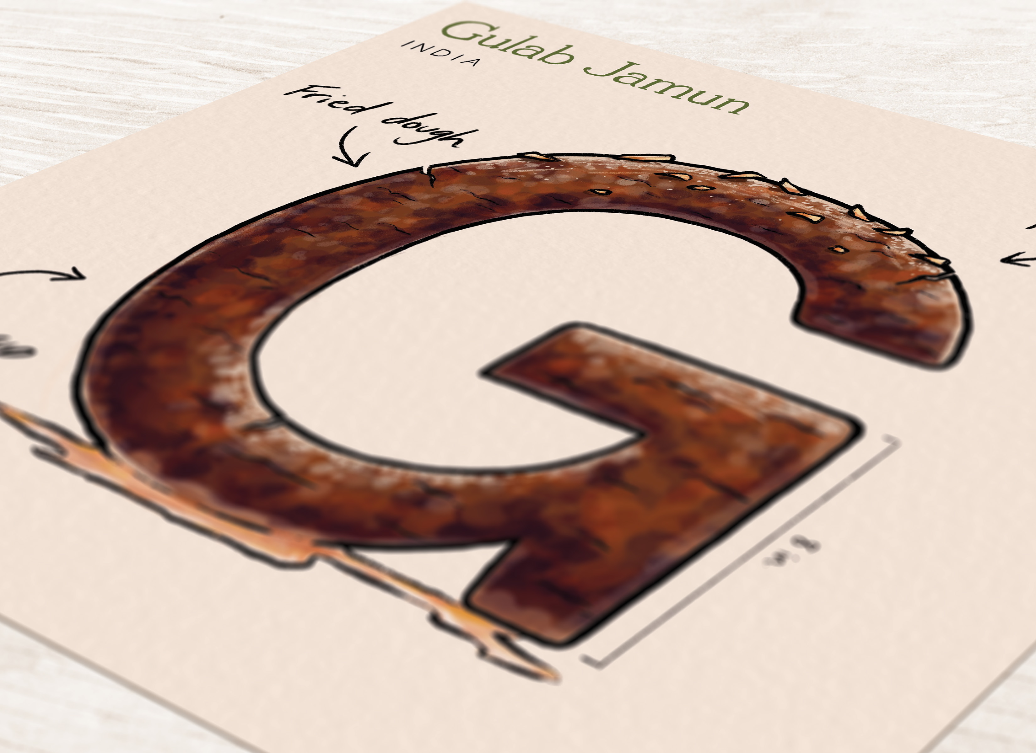
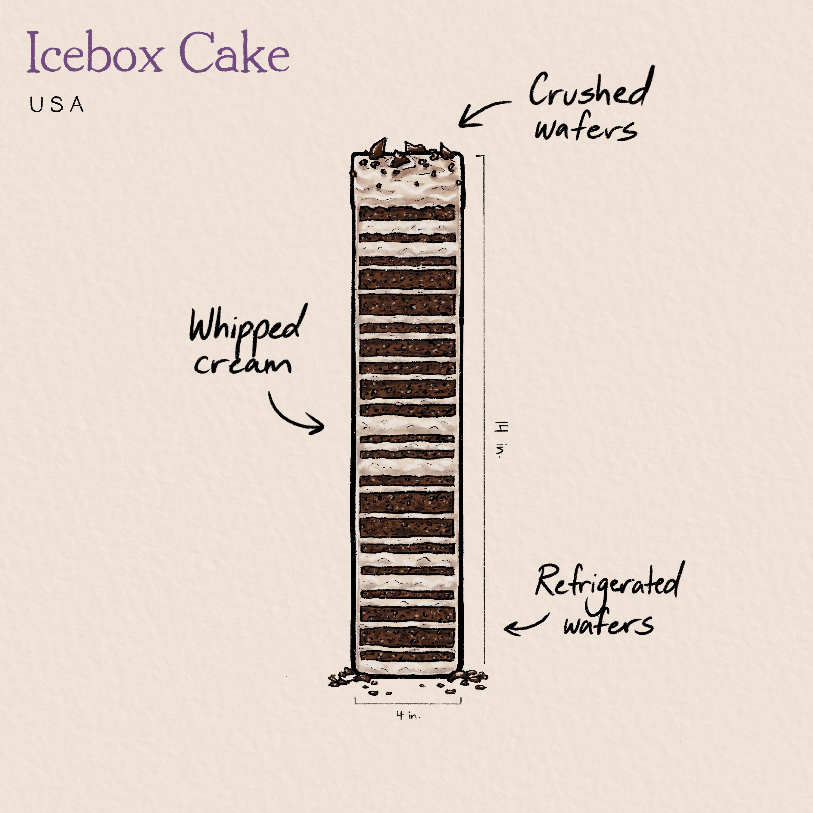
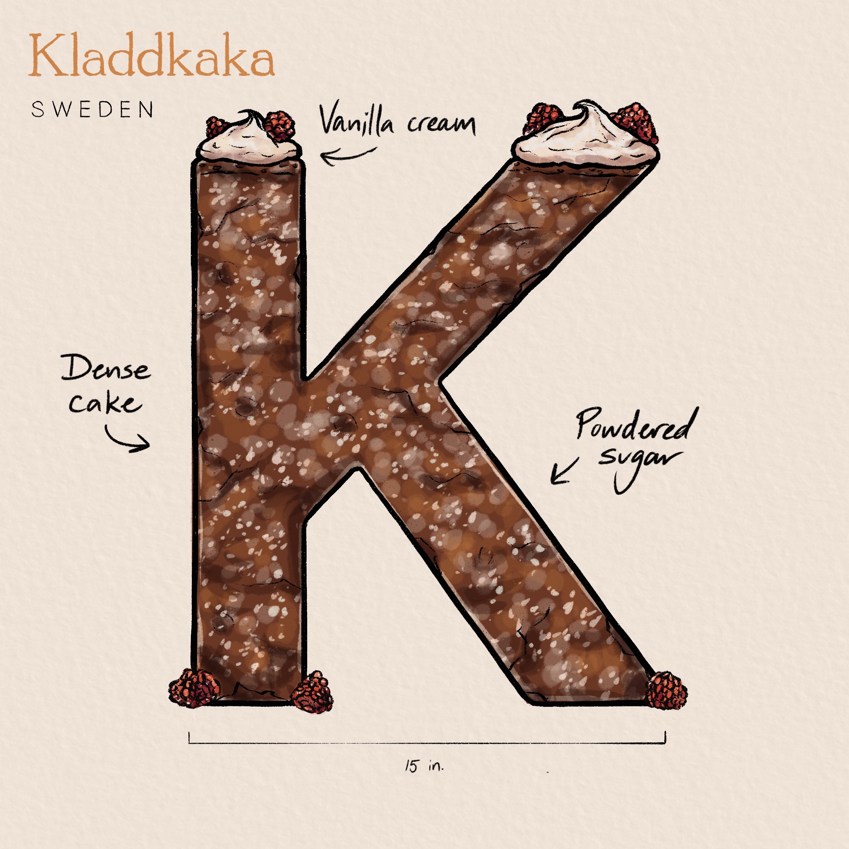
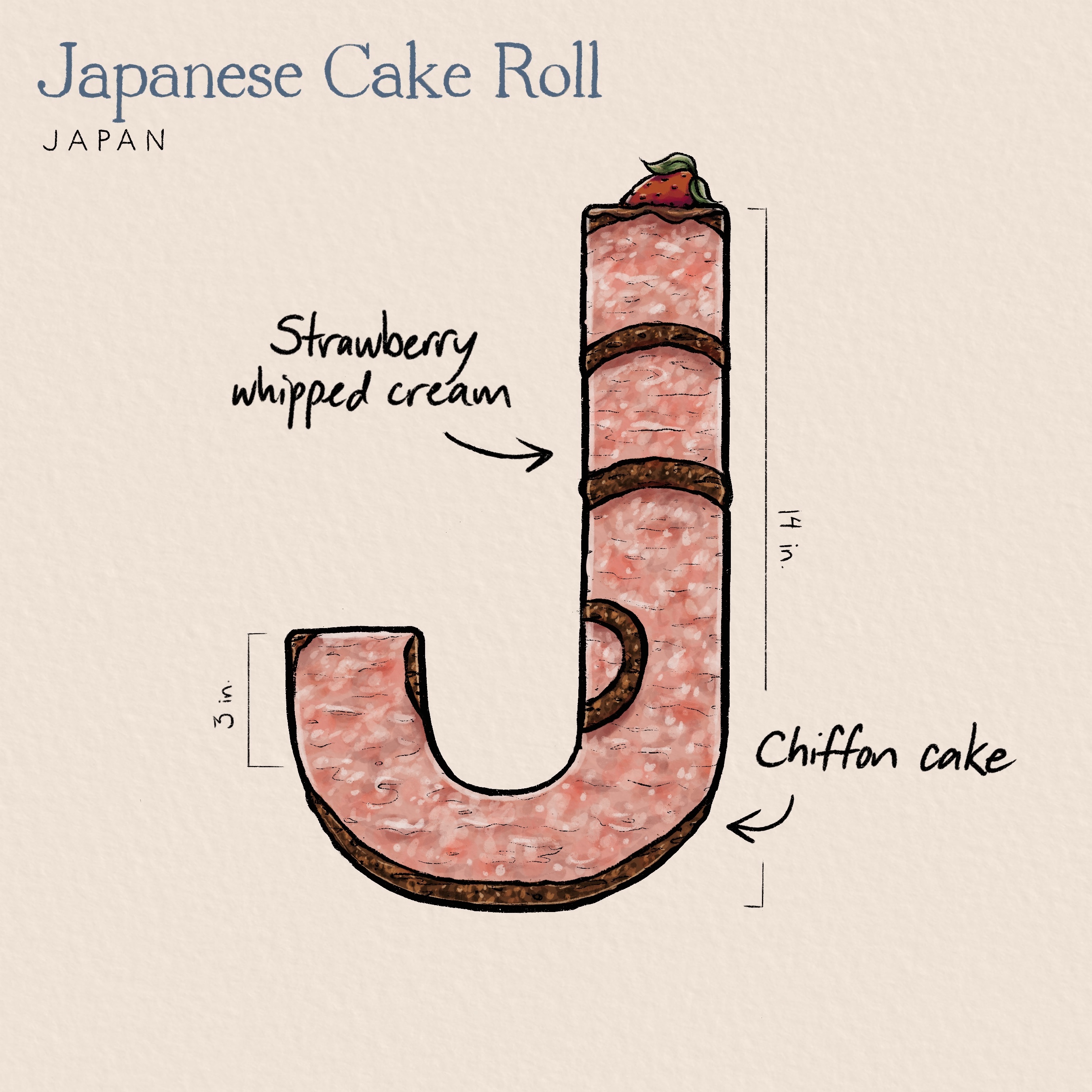
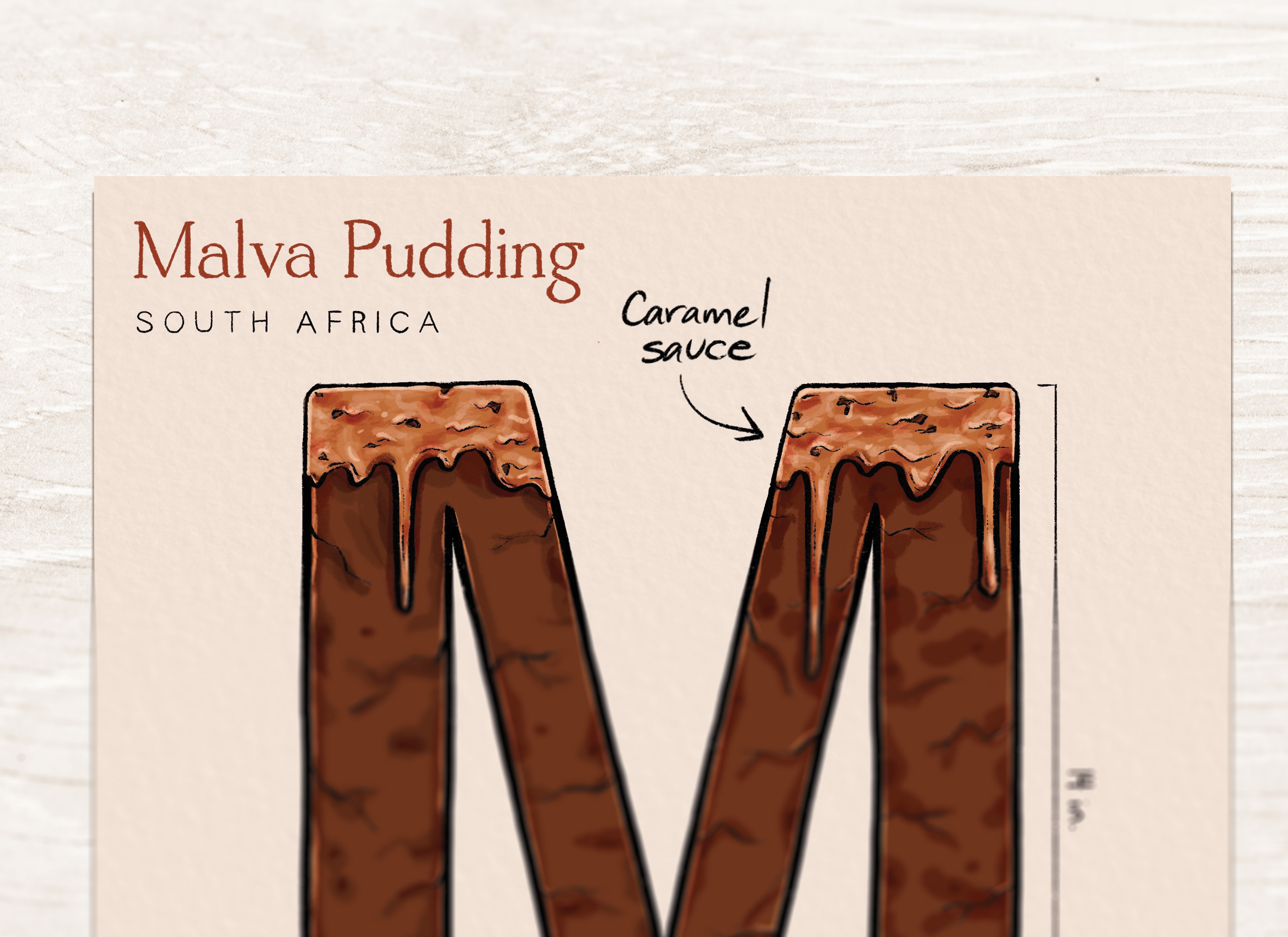
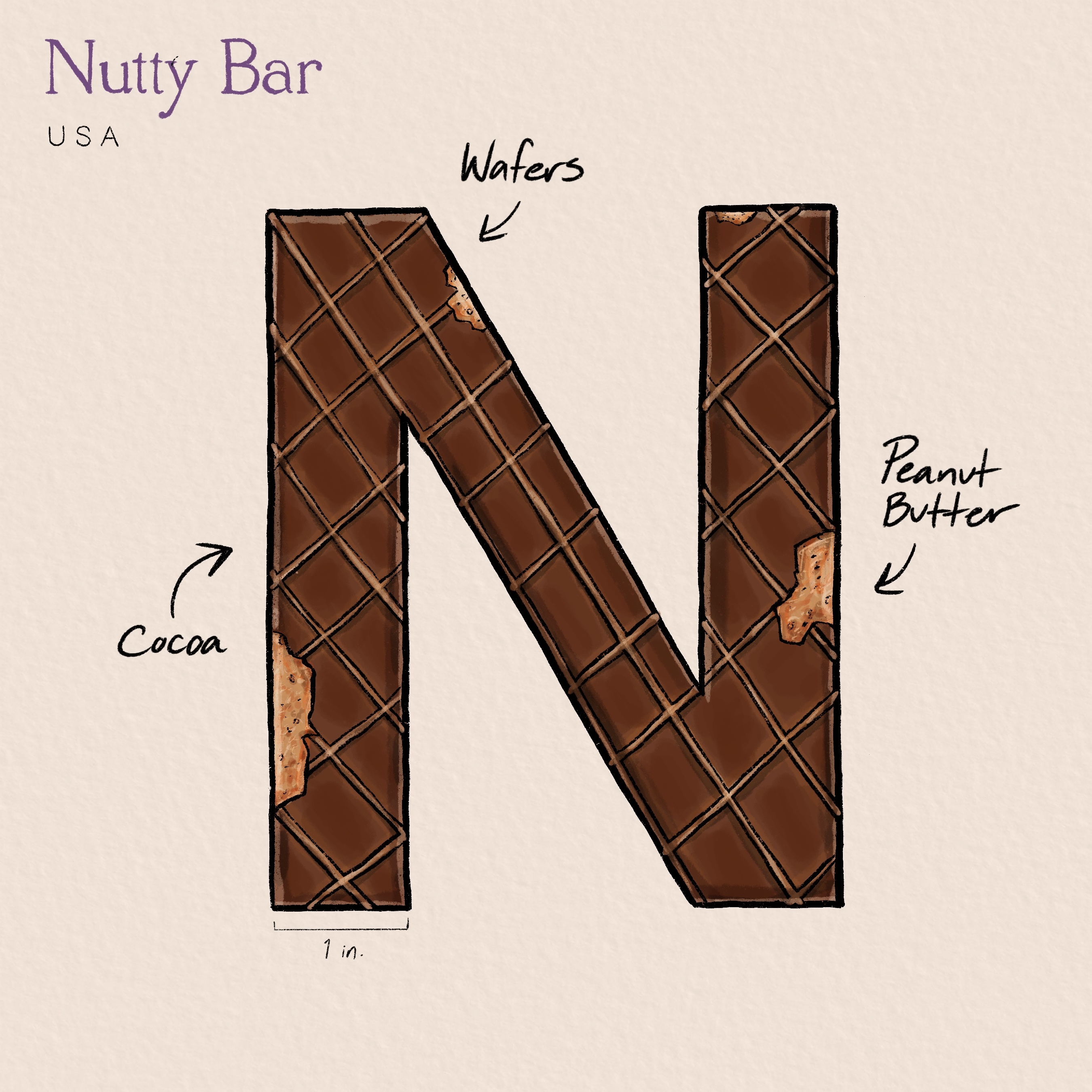
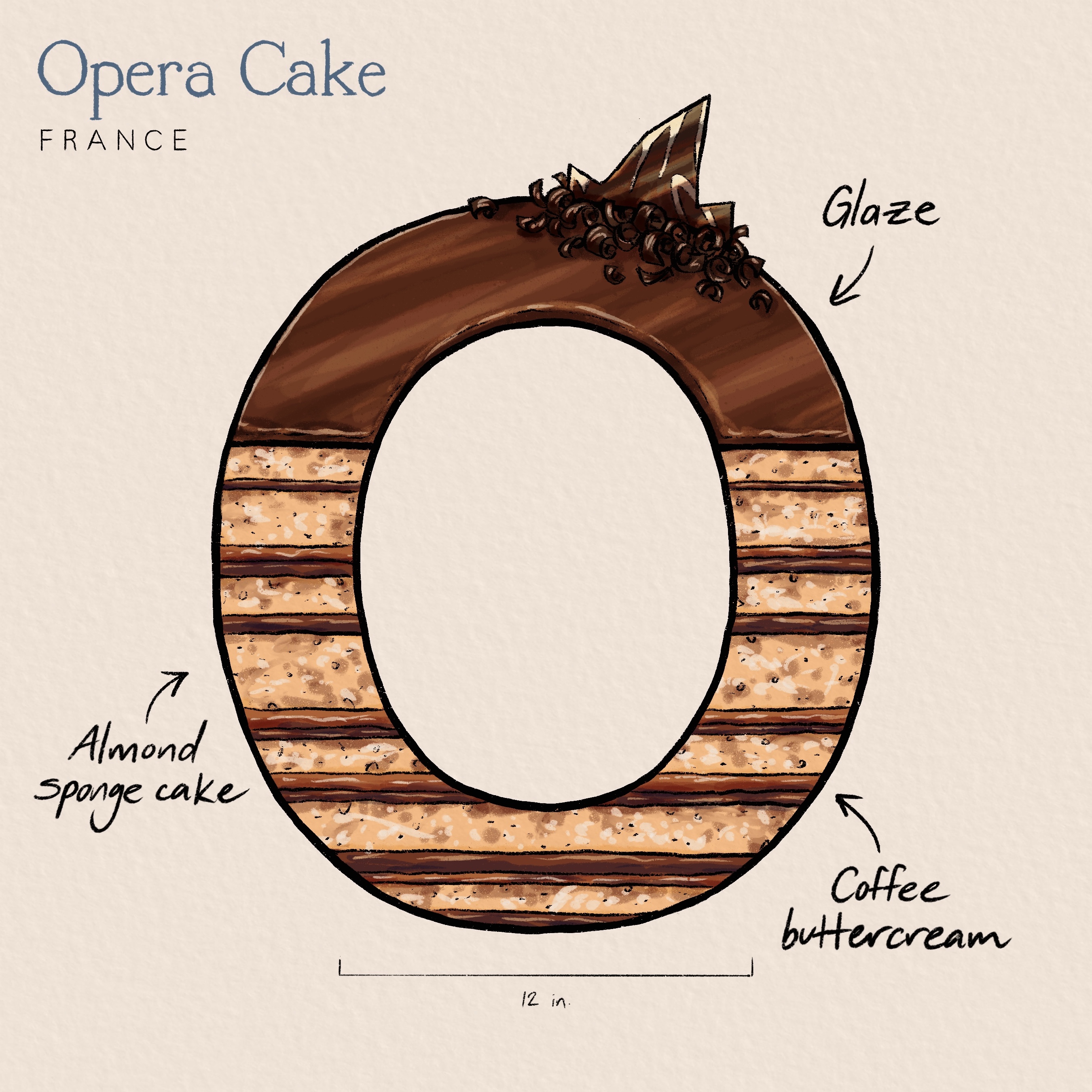
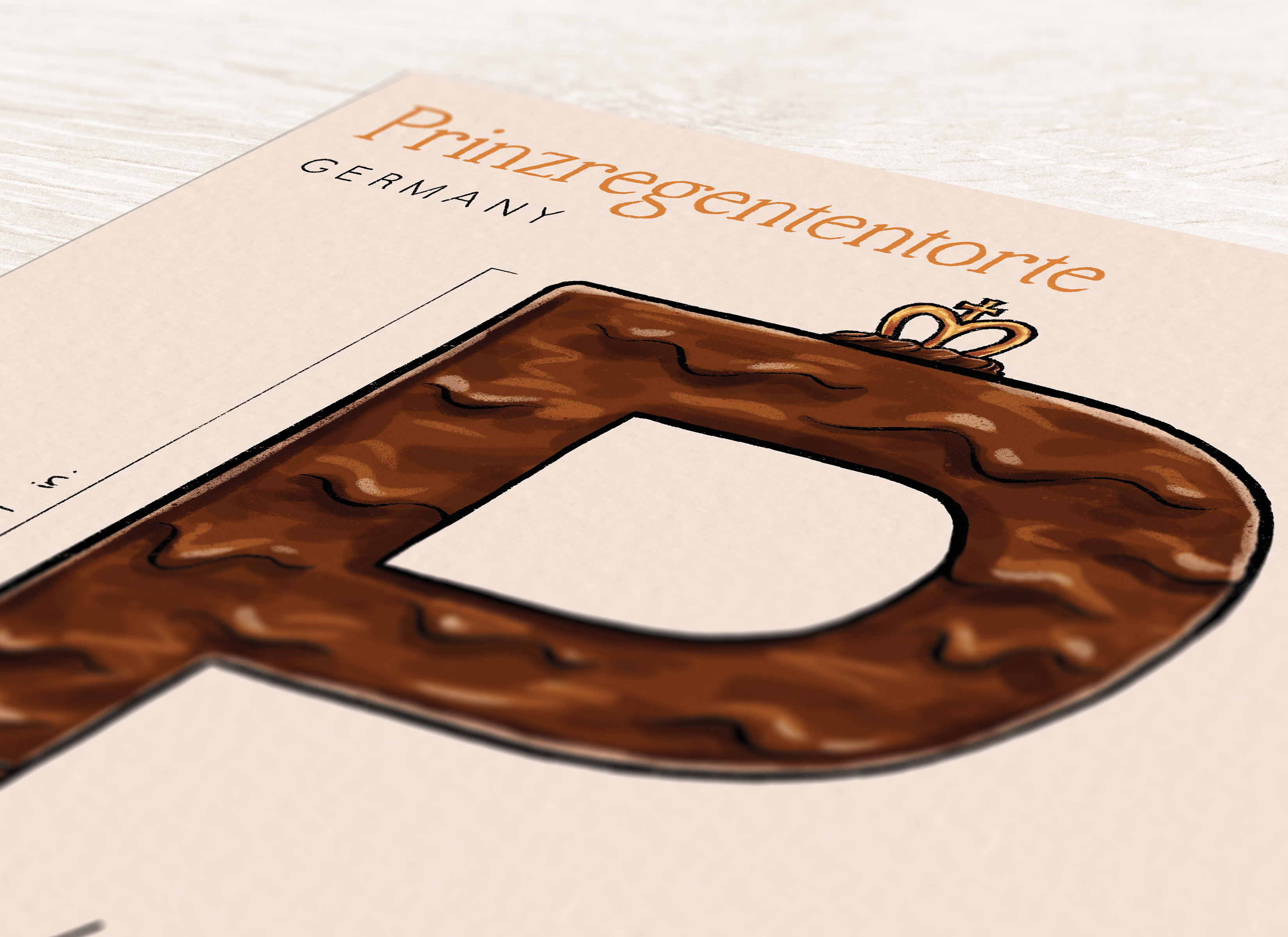
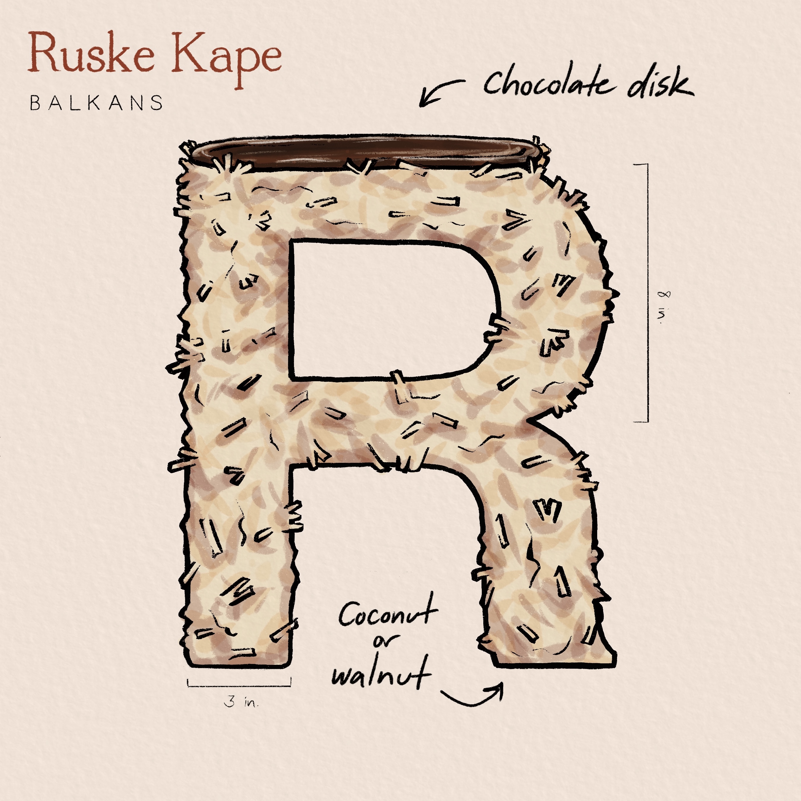
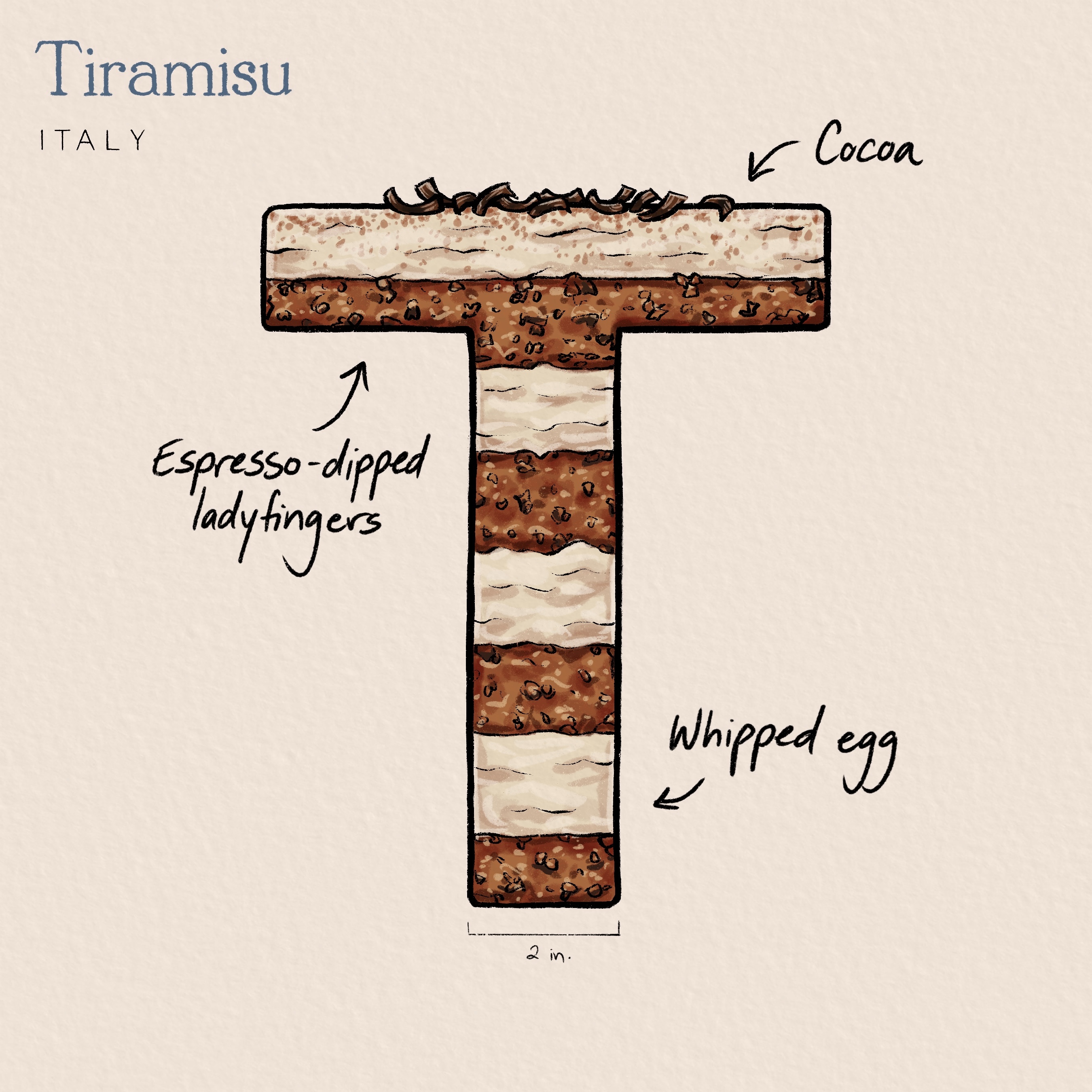
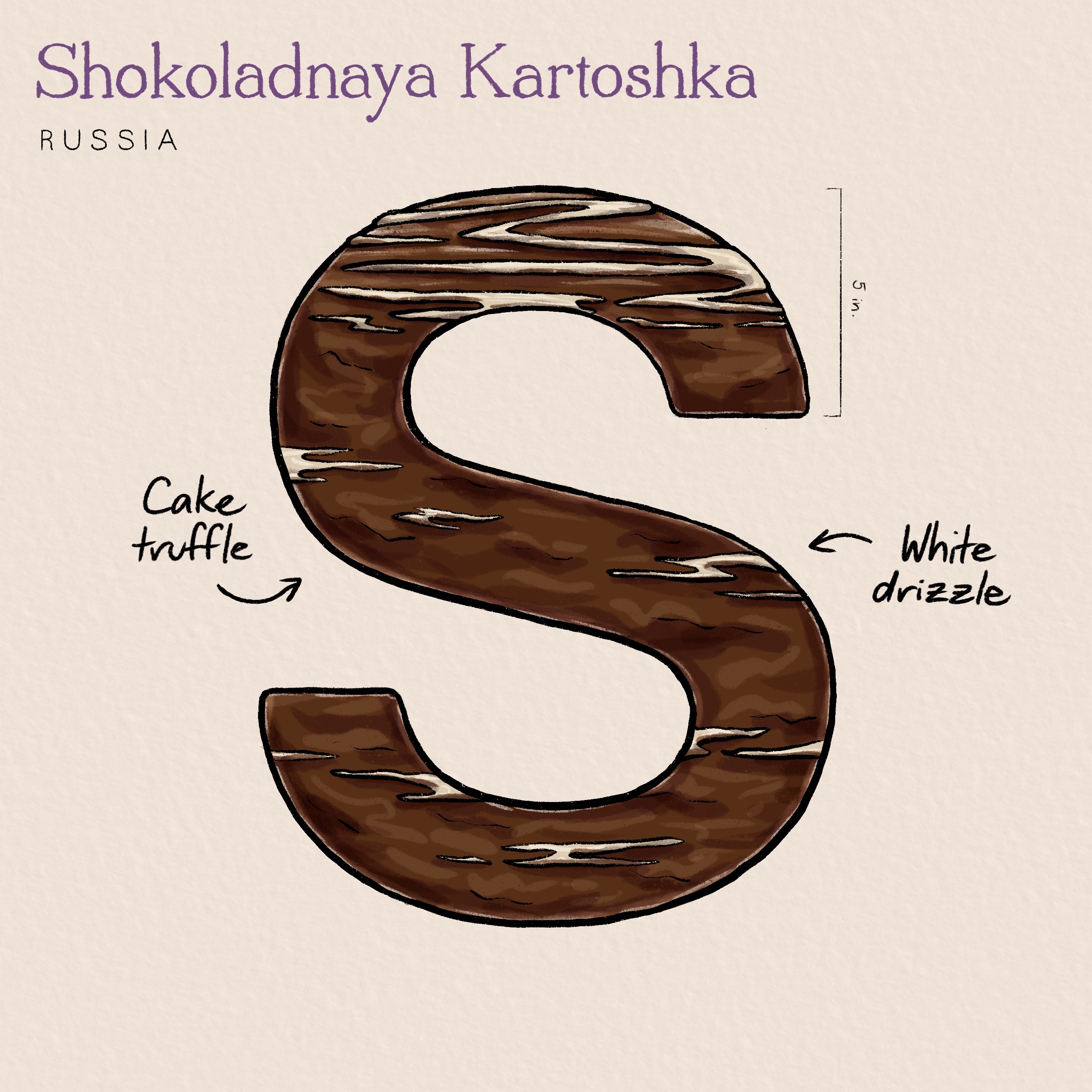
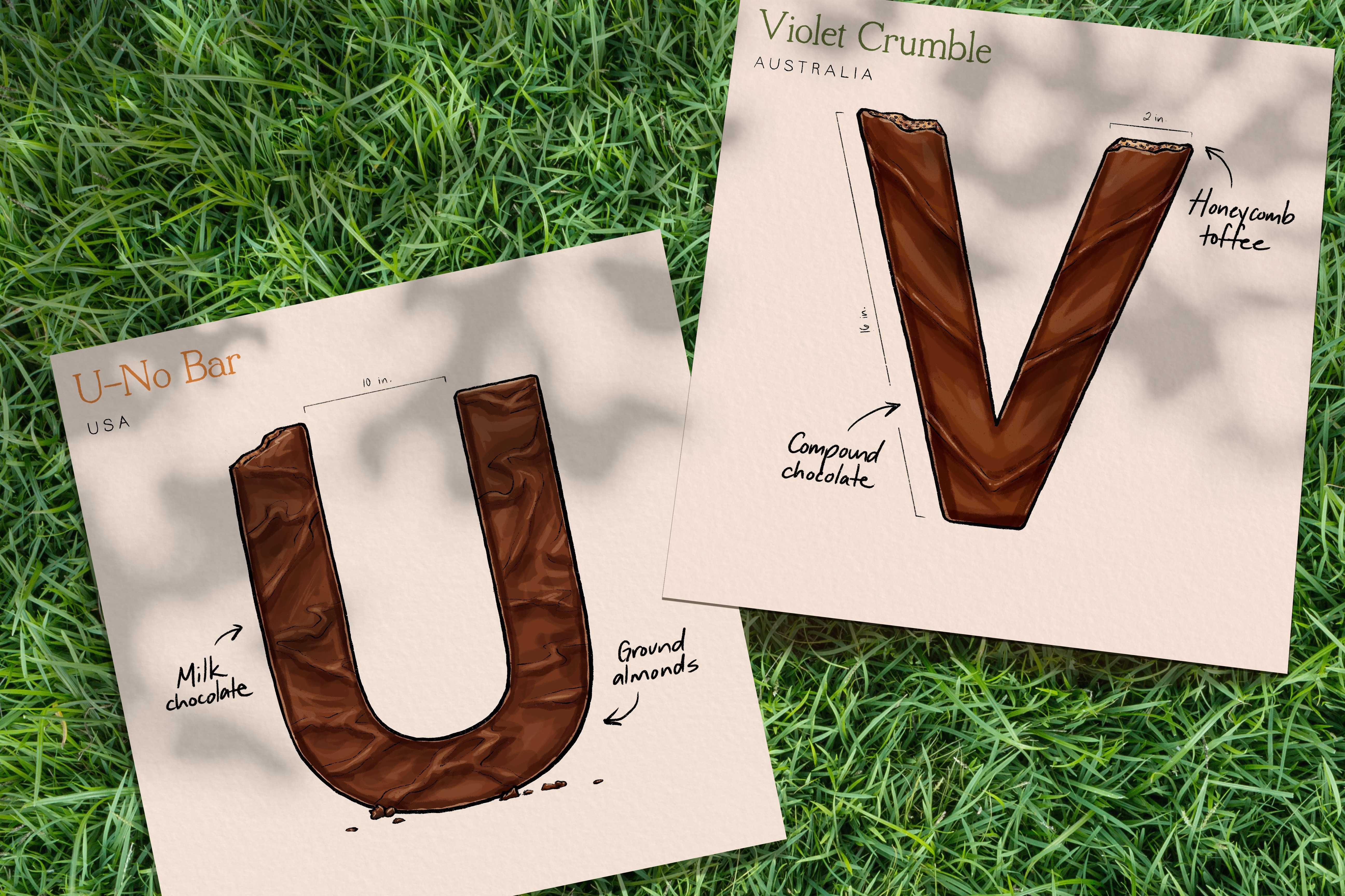
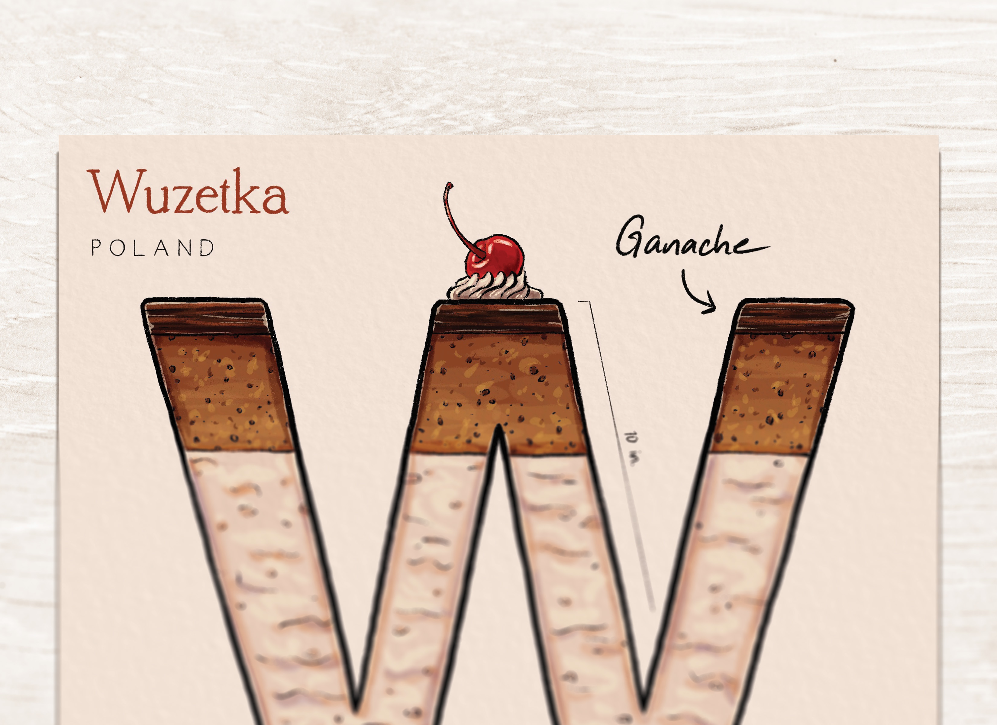
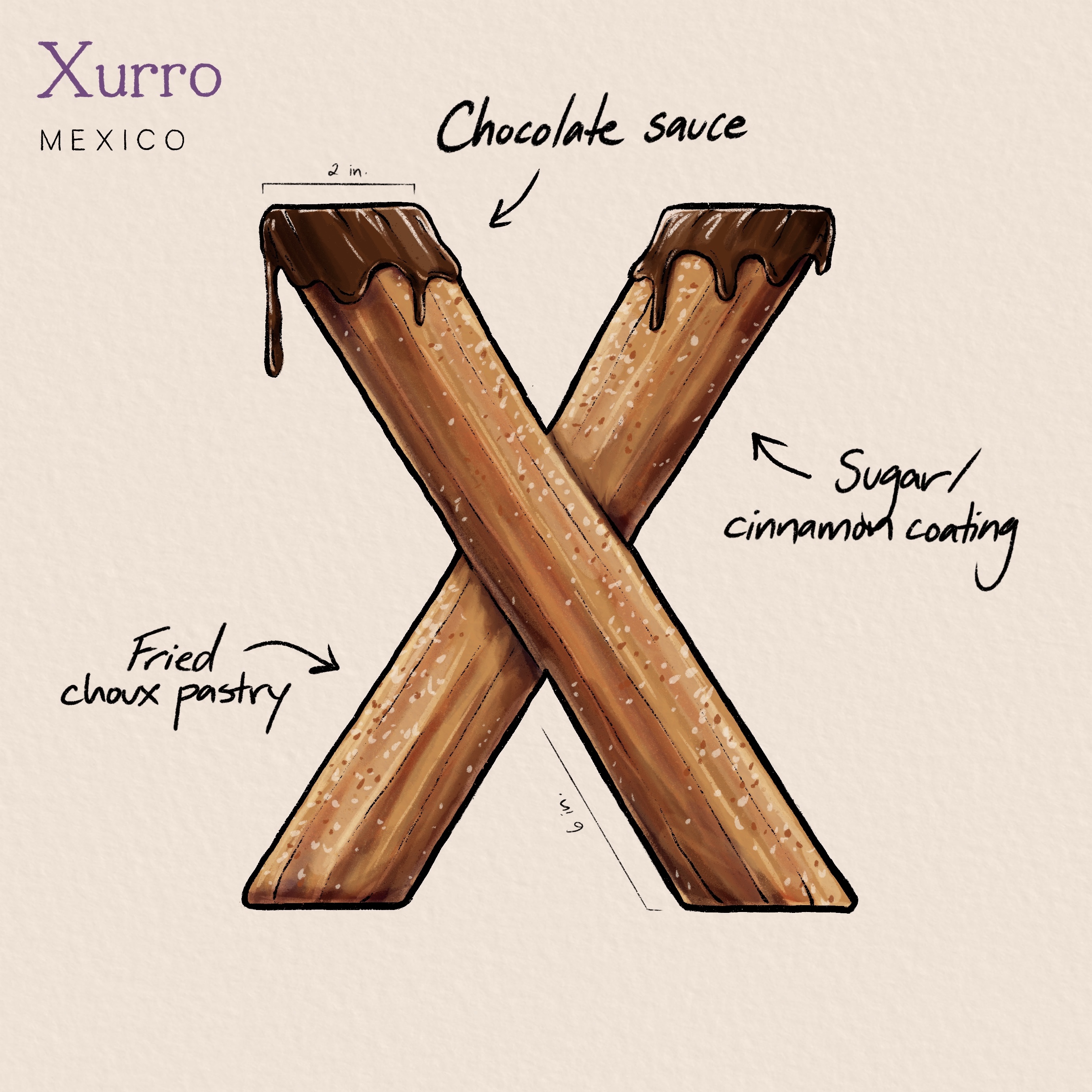
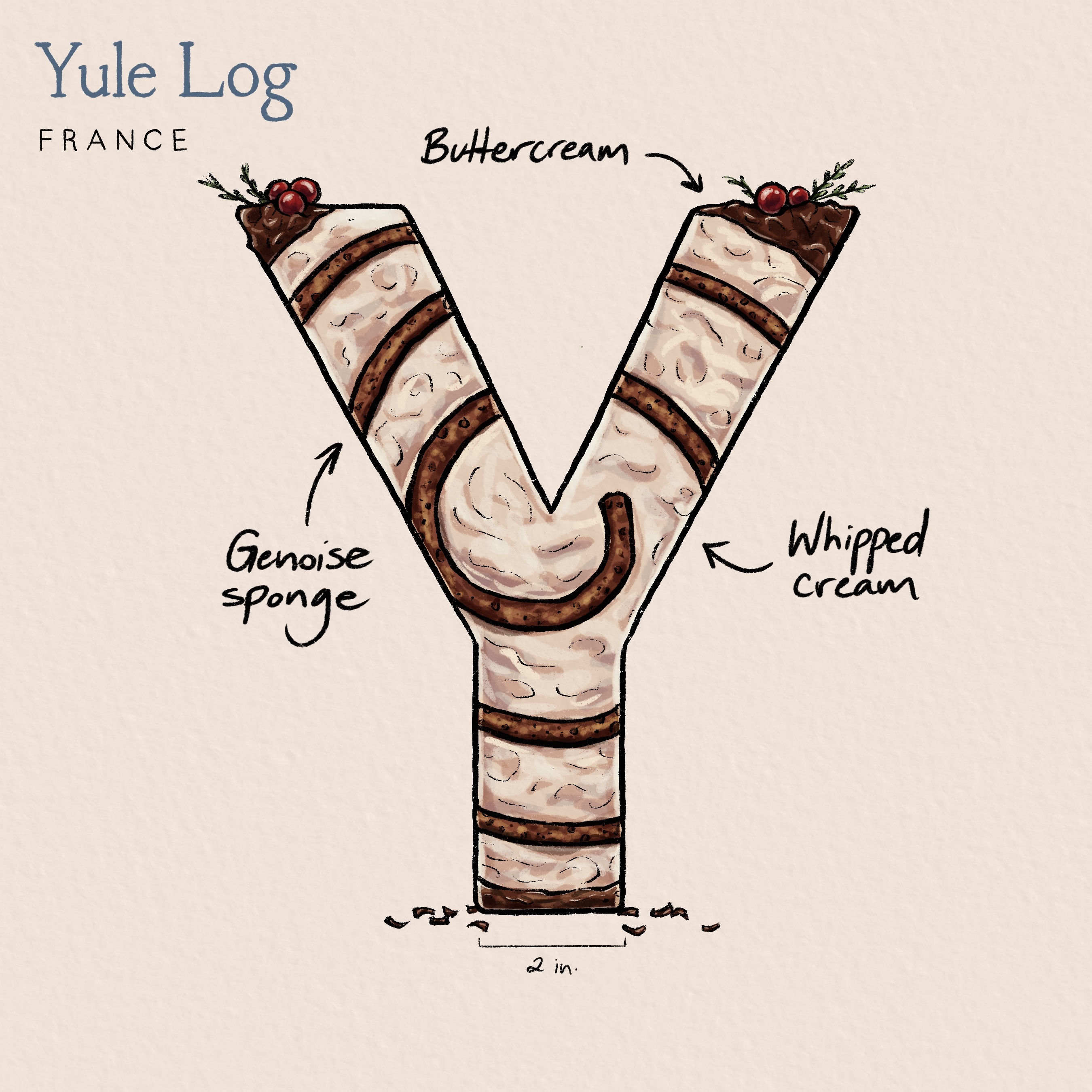
The creation of the "ABCs of Chocolate Campaign" required extensive research to find the most diverse and unique chocolate varieties from around the world. The project aimed to cover six major continents and as many countries as possible. While there were challenges along the way, including the difficulty of finding exclusively chocolate desserts for each letter, I persevered. Specifically, I drew inspiration from The Great British Bake-off, a baking competition I watched regularly with my family in high school. The sketchbook-like diagrams seen on the show were adapted and polished in my own art style to create a visually appealing design for the alphabet system.
The lack of drafting images may be noticeable, but having few preliminary sketches is due to the focus being on a trial-and-error approach to drawing each dessert. By using this method, I was able to quickly refine and create a version of exactly what I wanted, making the process more efficient and streamlined.

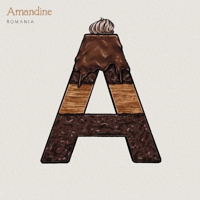
I only used two different brushes - the Dry Ink brush and the Thin Ink brush, both of which possess detailed textures that complement each other nicely. Using just these brushes, I was able to experiment with a plethora of different patterns and textures that would set each dessert apart. In addition, the dessert names alternate in a rotation of five different colors to create visual variety in the finalized poster. The outcome is a visually compelling campaign that showcases a range of delectable chocolate delights.


In conclusion, the "ABCs of Chocolate Campaign" was a successful project that not only showcased a range of chocolate varieties but also taught me about different desserts I had no idea existed before. Looking forward, I would love to print these out and distribute them as prints or stickers, further promoting the theme of the project and leaning into my love of wall art. As a whole, the campaign was an intriguing insight into cultures that I had never researched before, and I am proud of the outcome.